Dog Treats – Cafe Style Packaging Design
The Challenge
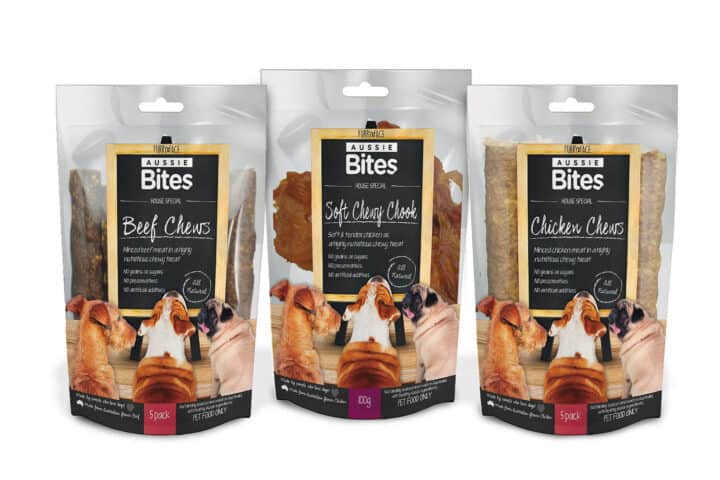
Aqua Blue Distribution contacted me about packaging for a dog treat range they were developing. They wanted it to have a cafe feel – the concept was that dogs would be choosing treats from a cafe menu.
The tricky bit was that they wanted to show off the actual treats as much as possible, but still make it look premium and special. Had to be different from the usual pet food packaging you see everywhere.
The Process
I worked with the cafe idea and used different dog breeds as characters on the packaging. I used chalkboard styling and handwritten fonts to get that cafe menu look.
The pouches were clear plastic with resealable tops. Had to be careful not to block the see-through parts because they wanted customers to see the treats. Different colours for each pack size helped people tell them apart.
Did the same layout on both sides so the clear sections matched up. Customers could see the treats from front and back, which showed off the quality.
The Outcome
The design worked well for what they wanted. The cafe look made it stand out from other dog treat packaging, and you could still see plenty of the actual product through the clear sections.
The colour coding helped people navigate the different products in the range, and the whole thing felt more premium than typical pet food packaging. Aqua Blue Distribution was happy with how it positioned their new product line.
Like what you see
Let’s work together to create something great. If you’re ready to start your next project, I’d love to hear from you.
More case studies