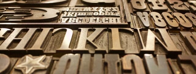
A lot goes into creating a brand and did you know that font selection evokes different emotions?
Let’s breakdown the difference between typefaces and why they are used and what emotions they evoke in the viewer.
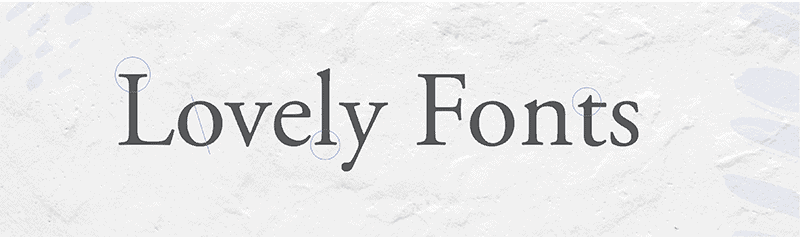
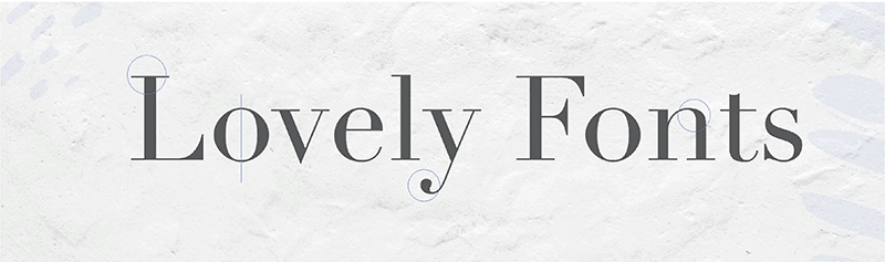
Serif
A serif font has the strokes at the end of the larger letter like the lines on the bottom of a Capital A or the vertical lines on the top of the Capital T. They can also have variable line weights in their up and down strokes.
You will find serif fonts used a lot in printed items like books, reference books and newspaper. The main reason serifs are used for these purposes is because they are easy to read quickly. This is due to the ligatures making words quickly identifiable to the reader.
When used in branding these fonts evoke a feeling of tradition and heritage. Because their classic nature they give a sense of respectability, reliability, comfort and make a brand feel established and authoritative.
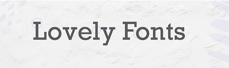
Slab Serif
A subset of these fonts are the Slab Serif. These fonts look like serifs but have thick blocks that may be blunt or angular or even rounded. They are geometric and strong with minimal variation to type width.
Due to their bold nature they are intended to grab a readers attention and have been used well in posters. The strong nature of them also lends itself to smaller text sections that need emphasis.
For branding they can show solidarity, boldness and impact. They can install confidence which evoking creativity.
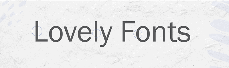
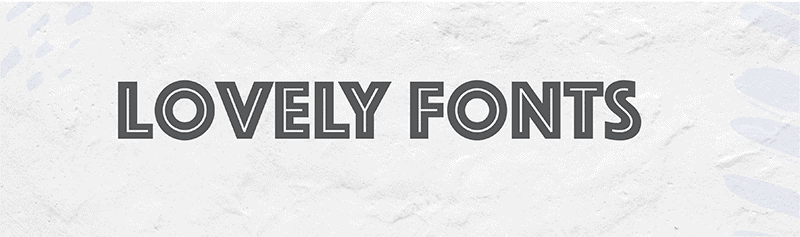
Sans-Serif
Sans-serif fonts don’t contain the extra lines that serif fonts have. These fonts tend to be the same weight on all their strokes. They are less “fussy” and simplistic.
These fonts are used a lot in advertising, headlines in magazines and newspapers. Web Design tends to use sans-serif fonts more as well. They look clean and modern.
For branding they can induce a feeling of honesty, cleanness, stability, forward moving. The uncluttered nature of the font has less to distract the eye.
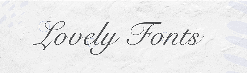
Script
Script fonts are created to mimic handwriting and can come in a variety of styles from traditional to the more casual.
They are generally used for display purposes, packaging and invitations. One things to remember when choosing script fonts is legibility. Make sure that your viewer and read it and it’s not too small and that all the letters read correctly.
In branding these fonts evoke elegance, femininity and creativity. They can make a brand feel personal and warm.
Modern
The modern fonts have a strong contrast between their thick and thin strokes. They tend to have a vertical axis and a mechanical appearance. Another design aspect of these fonts can be their rounded nature and the angles on the end points of the characters. Modern classified typefaces can be either serif or sans-serif in nature.
These fonts evoke a sense of progressiveness and strength. They have a sense of simplicity and legibility and can convey feelings of style and exclusivity.
Display & Decorative
Display fonts are intended to be used at a large size like headlines. They are not ideal for passages of text due to legibility for the reader. These fonts stem from a wide variety of backgrounds including calligraphy and hand lettering and are used as ornamental.
Due to their uniqueness they can be great for branding to convey uniqueness. The evoke feelings of friendliness, fun and can be extremely expressive.
Having a bit of an understanding behind typefaces and how they evoke different emotions, can be the key to figuring out which fonts you can use to communicate to your audience.
In fact, the font you use for your logo could even be a part of your differentiation strategy.